
Color Theory: Mixing Colors

This week, we get to a topic that’s near and dear to my heart, mixing paints. There is a lot that goes into it, and it takes some getting used to. Different paints have different properties. Some are more opaque than others, some are single chemical pigments, while others are mixtures already. With most miniature paints you buy on the market, the vast majority already contain white paint stealthily mixed in, which causes a whole mess of other problems.

The Color Wheel
We’ve all seen this, or something like it before. There is some silly debate over if you should use a RYB (Red Yellow Blue) or CMY (Cyan Magenta Yellow) color wheel, which I’m not going to get into much, because they’re just different tools to show different things. For the sake of this article, we’re going to stick to RYB, because it’s what I use.
A lot of people assume the color wheel just shows you that Blue + Yellow = Green, and while this is relevant information, it’s the relationships which are really more important. Today, I’m only really going to get into complementary colors, and why they’re important, since that’s the most directly relevant part of the traditional color wheel when it comes to mixing.
Chromatic Black
When you mix colors that are across the color wheel, the resulting color you see is going to appear darker. By carefully controlling the amounts of each paint you use, you can use a complementary color to create a chromatic black. Take a look at this chart showing a mix of Quin red and Phthalo emerald:
These colors are situated almost perfectly across the color wheel from each other, and when mixed in proper ratios, create a very black color. While they are not perfect, totally black, on a model, or in a painting next to other colors, it’s going to appear black-enough. The reason these chromatic blacks are important is because when they mix with either color they’re part of, they make a nice, smooth transition. Shading with black tends to make muddy colors (as you can see on the right-column of the chart), but mixing with these chromatic blacks, you end up with richer looking shadows.
If you haven’t guessed, this is something which your typical model paints will often struggle with. To add variety to their lines of paints, companies which produce miniature paints add varying amounts of white into their paints. This increases opacity which hobby painters appreciate, and can turn one shade of blue into 4 different shades for consumers to buy. The downside is that you cannot make something look black by mixing white into it!
Tinting Strength
You probably have a pretty good idea what color you’re going to get when you mix a couple colors, but where it can get tricky is understanding the relative tint strength of colors. When you mix colors, you’ll often find that mixing 1:1 does not always result in the color you’d expect. The color may still feel too close to one of the starting shades, that’s because of the relative tint strength. Here’s a little example showing yellow, which has a super low tint strength mixed with phthalo blue, which has an incredibly high tint strength, as well as some white to make the colors a bit easier to see.

You can see that mixing them in equal amounts makes a color which is still way more blue than yellow, not a green which is somewhere between the two. Instead, you need to get closer to a 10:1 mixture of yellow to blue to get a more mid-range green.
Limited Palettes
Above you can see a color chart I made using the Kimera Kolors line of paints. Their paints behave much more like traditional artist paints than the miniature paints you’re probably used to, and it means they can make very rich color blends. Instead of using a huge variety of individually bottled paints, by understanding mixing, you can create just about any shade you can think of through mixing.
Using a limited palette really just means, using a finite number of paints to make a large number of colors. If you were to use the full line of Kimera Kolors, you’d be using a limited palette of 13 colors, including black and white. That said, using 13 colors is hardly what most artists would consider a limited palette, since you really can mix pretty much any color you could imagine. The chart above only shows two-color mixes, which is really the very least you should do, you can then control the saturation of the color you mixed by adding white, black, or mixing it’s complement.
If you really want to get limited, let’s talk about one particularly famous limited palette, the Zorn Palette.

The Zorn Palette
One of the most famous specific limited palettes is called the Zorn Palette, named for Anders Zorn, a Swedish painter from the late 19th, early 20th century. Many of his paintings were done using only 4 paints: Lead White (Flake White), Yellow Ochre, Vermilion and Ivory Black (though he would occasionally throw in some cobalt blue when needed). By mixing these four colors, and really understanding how they react to one another, artists have used this palette to do some really incredible paintings. You’ll notice that there is no blue in the palette, instead the Zorn Palette relies on the blue-bias that Ivory Black naturally has. By mixing black with yellow, you actually end up making a shade of green, which you may see in the chart above, as well as the right-most column of my Kimera Kolors color chart.
Here are some examples of paintings by Zorn, which really show the range of colors you can get, even with so few paints.


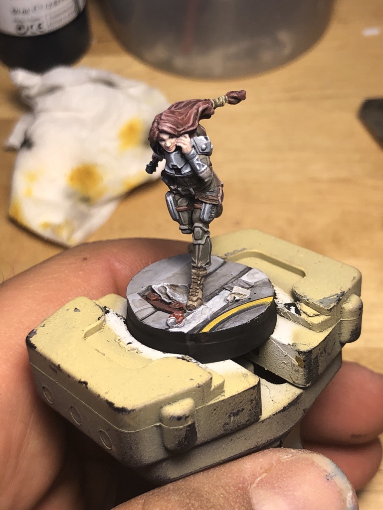
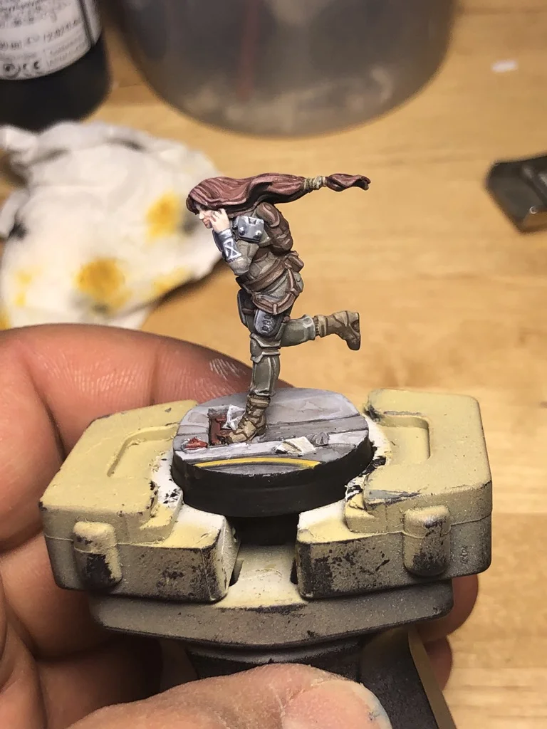
To demonstrate what this can look like on a miniature, I’ve painted this Warcor, using a palette very similar to Zorn’s, though I substituted his rich vermillion with a more subdued Red Ochre (which I’m told creates the palette similar to the Fayum mummy portraits).


Last Thoughts on Mixing
It’s easy to rely on the prescribed, pre-blended colors which are produced by so many paint makers. I’m sure many people go their entire lives in the hobby without mixing two shades together, but by learning about how paints behave when mixed, you’ll really improve your painting game. Something to learn when it comes to mixing colors though is that there are no rules. You can mix chromatic blacks for every color you use on a miniature for the shadows, which will be time consuming, and create a very specific look, but you could just as easily always use one shade (like a dark blue) to mix in to shadows, which can create a very different (and very lovely) effect.
Getting used to mixing your paints is going to take a lot of experimenting to get used to, so don’t feel like you need to nail it from day one. Keep trying different blends to get the shades you want, and don’t feel like everything needs to be totally uniform (especially if it’s not a space marine you’re painting), subtle variation, even on the same model, looks very natural.
Keep an eye on my Instagram, I just received my Kimera Kolors in and will be painting my minis with them for the foreseeable future. I’ll be sure to show my palette when I do though so you can see my color mixing in action.